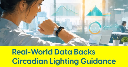
June 20, 2025
David Warfel: It's Time to Retire CRI

Guest author: David Warfel, Light Can Help You
Everyone loves talking about lighting acronyms, right? Ah, what a joy to discuss CRI, the Color Rendering Index, the gold standard of lighting quality for decades. Five of them, in fact, as CRI was introduced in 1974. Fifty years is a long time in a lighting industry that electrified barely over a century ago.
In other words, it is time for CRI to retire. So let’s throw it a party, preferably with a nice big sheet cake and some punch and move it along.
Yes, I hear you, I am fond of CRI, too. My first boss in architectural lighting introduced me to the Color Rendering Index about twenty-five years ago as a way to evaluate metal halide, compact fluorescent, and high pressure sodium lamps (aka bulbs). I pored over lamp catalogs (in print!) and selected the lamp with the highest CRI I could find. Why? Because I wanted everything in our projects – the furniture, flooring, finishes, and people to look their best.

Imagine you are a grocery store owner who wants to sell more apples, and you heard from another store that getting better lighting impacted their sales numbers. So you head out to big box retailer, find an LED bulb with a high CRI, and figure you’ve got it made, right?
For reasons you cannot explain, however, the apples on display look worse and sales, understandably, drop.
(You can alter this story to apply to just about anything from wooden floors to upholstery covers to skintones.)

In a proverbial nutshell, here is why CRI comes up short. CRI measures apparent deviation from a reference source, itself variable. And that deviation, measured on a scale from 0-100, does not give us any indication of how the source deviates from the reference.
Confused? You are not alone. CRI does not, as I once thought, tell us “how true colors appear” under a given light source. More technically, CRI tells us “a rough measure of how much a color deviates in appearance from the same color when viewed under a perfect light source of the same color temperature as the measured source.”
Okay, I am still confused.
Think of it this way. In the graphic above, colors can be perceived perfectly in, let’s say, sunlight at 5000°Kelvin (the color temperature). Therefore, we might think of a 5000°K LED bulb with a CRI of 90 as approximately 10% “inaccurate.”
But “10% inaccurate” how, exactly? CRI will stay silent on the subject.

Color appearance can deviate in many ways. A particular source may make your apples look more saturated (you might call it “brighter” or “more vibrant”) or less saturated (perhaps “dull or “lifeless”).
Hue might also be shifted by different light sources, causing the apples to look a little greener or a little more magenta. So which CRI is best? 100, right?
In the graphic above, you can see that a CRI of 80 or 90 might make the apples look worse – less saturated, or more green, etc. But you may have noticed that a CRI of 80 or 90 might make those same apples look better. Why? Because humans have a preference for saturated colors, especially when buying apples. They are red for a reason – that color is attractive and signals ripeness.
Our poor grocery store owner might have bought a light bulb with CRI of 100 but their competition bought one with a CRI of 80 and is selling more apples.
The trick is that CRI of 80 won’t tell you whether the apples are going to look better or worse, just that they will look different in some way.

Tony Esposito, who knows more about color and light than I ever will, is happy to see CRI retire, but that does not mean he hates CRI. It’s just an old standard, and standards are almost always outgrown.
Paper and quill, perhaps with a wax-sealed envelope and the Pony Express, set the standard for quick-yet-personalized messages ages ago, but the new standard gets our messages across the globe at speeds unconceivable when horses at gallop meant “fast.” There was nothing wrong with handwriting a letter and perhaps there is still some nostalgia for it but send me a text if you want a response today. Within minutes.
Standards need updated.

It takes time to change standards, especially when the new standard is built according to ANSI (American National Standards Institute) rules. Due process, consensus, and transparency are required, public review and comment periods are a must, and all of this adds up to years of dedicated work before a standard becomes official.
And then there is the time it takes to change people’s behaviors, and that can make the lengthy standards development process seem like breaking the sound barrier.
It took a few years to develop CRI’s replacement, ANSI/IES TM-30 (how’s that for a mouthful). That was ten years ago, and TM-30, while vastly superior to CRI, is rarely used in residential lighting.
What is TM-30? In short, it is a method of evaluating color rendition that tells us much more than CRI through the use of multiple indices like the Fidelity Index (Rf) and Gamut Index (Rg) and my personal favorite, the Color Vector Graphic. Where CRI outputs a single number, TM-30 outputs more than a hundred individual metrics that can be utilized to evaluate a light source. Where CRI uses 8 (or 9 in the case of CRI R9) color samples, TM-30 uses 99.
And, unfortunately, that means TM-30 is not particularly easy for most of us to understand. I won’t try to explain all of it here: I am not the right person to do so and this is a blog post, not a dissertation. But I will attempt to explain the Color Vector Graphic.

I am a visual learner: if I see it, I learn it. TM-30’s Color Vector Graphic, which looks something like the sketch above, is a visual representation of a light source (the red line) when measured against a standard (the black line).
Remember the apples above? A light source with a CRI of 90 could make the apple look worse but could also make the apple more appealing depending on the particular effects on saturation and hue.
The example of a Color Vector Graphic above shows a light source that will have decreased saturation in the blue-green hues and increased saturation in the orange-red hues, meaning it might not make the leaf look its best but could make the apple more appealing. The Color Vector Graphic thus allows us to more closely evaluate the appropriateness of a light source for our needs. Illuminating a house with a lot of warm finishes? Or lighting up a garden? Look for sources that boost saturation (or match the black line) in those areas of the color spectrum.
I am honestly not sure yet how to make TM-30 a more integral part of my own work. We move quickly through the design process in order to save money and time for our clients; adding in extensive TM-30 research will make our services less affordable.
I have known for a number of years that TM-30 is superior to CRI, but Tony’s presentation last week lit a new fire under me to figure out how to help our clients benefit from this important metric.
Standards change. It is time to retire CRI; it is also time to figure out how to make TM-30 easier for all of us to use.
Follow David Warfel’s Language of Light blog »
About the Author:
David Warfel is an overly sensitive, marginally materialistic, pseudo-tree-hugging Midwestern farm boy turned lighting designer, educator, author, and entrepreneur. He’s been either lucky or talented enough to land design opportunities in residential, hospitality, museum, commercial, and even the super-niche escape-rooms-on-giant-cruise-ships industry. When he isn’t boring someone to tears talking about lighting, David leads the quirky design business, Light Can Help You, into new frontiers in search of better lighting for more people.